Design system | Enterprise Software House

Essential knowledge of design systems

It's a common experience to find certain goods, apps or programs easier for us to use than others. It’s not only about how you feel with the brand, perceive aesthetic, or about the way you use to interact, your experience and abilities. While a well-designed user experience (UX) plays a significant role, there's also a notable consistency among products created by the same entity, allowing users to familiarize themselves more quickly. If you appreciate the layout or interaction of one product, there's a strong likelihood that you'll find similar satisfaction with another from the same source. How is this achieved? 

It's a common experience to find certain goods, apps or programs easier for us to use than others. It’s not only about how you feel with the brand, perceive aesthetic, or about the way you use to interact, your experience and abilities. While a well-designed user experience (UX) plays a significant role, there's also a notable consistency among products created by the same entity, allowing users to familiarize themselves more quickly. If you appreciate the layout or interaction of one product, there's a strong likelihood that you'll find similar satisfaction with another from the same source. How is this achieved? 

Design Systems used in apps are present in your life and have a big impact on you.

Have you noticed?

The more complex design system is, the more consistent the products are, and probably the better is user experience. Let’s take the popular Microsoft apps as the example. 

Despite serving distinct purposes, their common layouts, consistent navigation placement, toolbars with bunch of functions unique to each application and recognizable pictograms enable swift comprehension. From the outset, users can execute fundamental actions effortlessly, gradually uncovering the complexity of these tools over time.

With Microsoft’s programs entrenched in our professional landscape for over three decades, they’ve evolved into indispensable work aids for many individuals. Virtually anyone with access to a Windows-based computer is familiar with these applications. Similar parallels exist with products from Google, which, while functionally comparable, boast distinct design schemes and solutions. 

In essence, this encapsulates the essence of Design System-driven applications: 

  • Consistency in appearance 
  • Utilization of shared basic components, facilitating familiarity through usage 
  • Consistent placement of navigation and common functionalities 
  • Uniform spacing between individual components 

By adhering to such principles, Design Systems ensure coherence across product lines, preventing user confusion and enhancing user experience. Consequently, this approach offers range of benefits for companies. 

What Design System should contain to be efficient?

A Design System can be defined as a set of rules, guidelines, styles, best practices, and pre-built component libraries. Its purpose is not only to dictate how users should interact with these components but also to establish the principles guiding their implementation. 

Among the fundamental elements of a design system are: 

  • Colors (tones, shades, or gradients) 
  • Logos and trustmarks 
  • Graphic elements (icons, illustrations) 
  • Typography (font families and their usage) 
  • Determination of element size and relationships (proportions, distances)
  • Navigation 
  • Rules for creating menus, interfaces, or forms 
  • Page and screen templates 
  • Grid systems 

Serving as the singular source of truth and essential documentation for products, Design Systems offer numerous advantages. They provide clarity regarding the usage of elements, furnish developers with a ready-made component library to expedite interface creation and minimize implementation time, moreover fortify projects against unforeseen changes resulting from new team members joining. 

While Design Systems may evolve over time, implementing changes is not hasty. Accumulating a repository of pre-made components allows products or services to be drawn from the library, rather than coding them anew each time. Consequently, any modifications to the Design System occur on a larger scale, particularly when coordinating multiple products within it. Hence, Design Systems prioritize solutions and guidance in scenarios marked by conflict or confusion. 

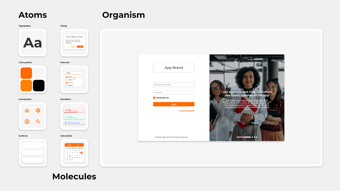
Design Systems pivot around three key elements: 

Atoms – fundamental elements such as colors, typography, and shapes, serving as the foundational and paramount guidelines. 

Molecules – groups of elements like inputs, headers, selectors, forms, toasts, date pickers, etc., constituting components integral to user interaction within interfaces. 

Organisms – templates derived from molecules, shaping application views or web pages, among other entities. 

When modifications are made to the Design System, they cascade hierarchically, with atoms influencing molecules, and molecules in turn impacting organisms. 

Do you need a Design System?

In general, a Design System presents itself as a commendable solution, yet its implementation is not always imperative. If you need to operate on a larger scale over an extended period, aspire to standardize multiple products, operate within diverse technological environments, or seek to harmonize the efforts of designers and developers, a design system may be necessary. Investing in such a system promises long-term dividends. 

Conversely, if your objectives pertain to internal projects—prototypes primarily centered on design, executed on a small scale, or intended for short-term projects —utilizing a Ui Kit might represent a more optimal and cost-effective approach. 

You’ve likely encountered the term before, but what exactly constitutes a Ui Kit? In essence, a Ui Kit is singularly focused on developed interfaces, either in part or in whole. It should include templates for pages, views or individual variants of components, e.g.: buttons, inputs, tiles. 

With a Ui Kit, designers can swiftly craft various window designs, leveraging a fixed set of solutions. However, the creation of new options necessitates additional creative efforts. Furthermore, implementation demands greater input from developers, as all elements must be hand-coded. In other words, Ui Kit is condensed relative to the size of Design System, tailor-made to cater to the specific needs of your niche. 

How to create a consistent Design System?

How do we approach this at All For One Poland? 

Creating a design system is quite a labor-intensive process, which we break down into several stages.  

At the outset, our aim is to establish a library of styles that not only aligns with our brand identity but also reflects prevailing trends. Using our collective experience, we develop universal solutions while meticulously validating our assumptions across different fields. We combine the work of designers and developers, enabling the creation of a library that, to some extent, automates workflows and mitigates the recurrent implementation of identical components across disparate contexts. 

Stage 1: Designing and creating specifications

Initially, our focus lies on defining the atoms. To achieve this, we refer to the brand book or other materials provided to us in the requirements. 

Decisions including the color scheme, typography, iconography, as well as shapes and character are meticulously made. What does it look like? Utilizing the client’s color scheme, we craft a comprehensive color palette enriched with gradations of the primary colors. We ascertain the method for constructing the color scheme in the interface, such as the 60-30-10 method employing neutral colors and a single accent color (the company’s color), or tonal building employing a range we establish. Additionally, we address the requisite colors associated with system’s information and alerts.
When it comes to typography, we need to establish licensing terms, as often a license purchased for so-called Desktop will be insufficient in the context of applications and websites. If costs are prohibitive, we explore alternatives or avail ourselves of free libraries offering typefaces of commendable quality. However, their widespread use across other products may render them “dated" and lack of originality. Once fonts are selected, we proceed to delineate a hierarchy of titles and texts, ensuring proper naming for programming purposes and order.
A similar approach is adopted for other atoms utilized in our interfaces. 

The next step in stage one will be the creation of molecules, which will consist of the various components and elements used in the interfaces sorted by their purpose. We design all elements that users interact with, essential for executing actions, aggregating and organizing information, adding new elements, validating them, and receiving messages. 

It is pertinent to note that designed elements may vary in size or appearance slightly across different screen types (responsiveness), which we take into account.. 

In addition, for the enrichment of the Design System we determine the possible variants of the components, acceptable for use – due to the fact that there are many situations, and we are not able to predict all of them at the beginning. 

The final step in this category may involve developing organisms, which are elements of applications composed of molecules and represent specific situations that users may encounter when interacting with products. These are typically specific but consistent elements across multiple applications, such as the login page, dashboard, menu, window components, toolsets, footers, etc. Such elements can definitely be included in the design system if necessary, thus ensuring even greater consistency across our products. 

Stage 2: Implementing the solutions

Once components and all accompanying documentation are finalized, the development team proceeds to implement the designed solutions into a shared resource library — the Storybook. This facilitates seamless integration during product development, enabling other developers to leverage pre-prepared interface elements, thereby expediting the creation of views. 

Maintaining open lines of communication between Designers and Developers ensures ongoing consultation, enabling comprehensive oversight and verification of the interaction’s progress. Within such a library, we specify the compatible technologies for the components, determine possible modifications or verify their appearance on different scenarios. This represents a highly convenient solution, affording all stakeholders the opportunity to ascertain component capabilities beforehand, while facilitating the onboarding of new employees. 

Stage 3: Validation

Upon the implementation of all elements into the products, we undertake validation to ensure adherence to guidelines and revise if all components function as intended within their respective contexts. Any inconsistencies prompt a reassessment, necessitating corrective measures. Working on developing a consistent system of styles doesn’t happen in a single session. That’s why the validation stage is very important. The cycle of shaping user experiences is based on reflection and testing the designed solutions, then returning to the ideation and design stage.  

Through careful processes, we effectively meet various business needs and make our products strong against sudden changes, showing how well our Design System works. 


In conclusion

You’re likely aware that many products you use daily are based on some form of Design System or set of guidelines. The more complex the Design System, the easier organizations can deliver satisfying results. However, a Design System alone isn’t everything; user comfort also depends on the simplicity and user-friendliness of individual functionalities for specific products or applications, which don’t necessarily have to be considered in a design system. While this solution isn’t the cheapest or quickest, its complexity should be tailored to the quantity and size of our individual needs. Nonetheless, it’s a comprehensive solution that can help resolve conflicts and make applications resilient to team changes. 

Write us Call us Send email


    1. Personal data is processed pursuant to Article 6 (1) (a) of the Regulation of the European Parliament and of the Council (EU) 2016/679 of April 27, 2016 – the General Data Protection Regulation
    2. The data controller is All for One Poland sp. z o.o. with its registered office in Złotniki, ul. Krzemowa 1 62-002 Suchy Las. Contact data of the Data Protection Supervisor: iod@all-for-one.com.
    3. Consent to data processing is voluntary, but necessary for contact. Consent may be withdrawn at any time without prejudice to the lawfulness of the processing carried out on the basis of consent prior to its withdrawal.
    4. The data will be processed for the purposes stated above and until this consent is withdrawn, and access to the data will be granted only to selected persons who are duly authorised to process it.
    5. Any person providing personal data shall have the right of access to and rectification, erasure, restriction of processing, the right to object to the processing and to the transfer of data, the right to restriction of processing and the right to object to the processing, the right to data transfer.
    6. Every person whose data is processed has the right to lodge a complaint with the supervisory authority, which is the President of the Personal Data Protection Office (ul. Stawki 2, 00-193 Warsaw).
    7. Personal data may be made available to other entities from the group that All for One Poland sp. z o.o. is part of – also located outside the European Economic Area, for marketing purposes. All for One Poland ensures that the data provided to these entities is properly secured, and the person whose data is processed has the right to obtain a copy of the data provided and information on the location of the data provision.

    +48 61 827 70 00

    The office is open
    Monday to Friday
    from 8am to 4pm (CET)

    Question about products and services
    esh@all-for-one.com

    This site is registered on wpml.org as a development site. Switch to a production site key to remove this banner.